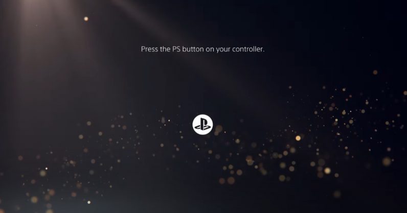
After so many months of delay, Sony is releasing a lot of new info on the PlayStation 5 in short order. Today, we got a look at what the new user interface looks like — and if you wanted more stuff in your console menu, then you certainly got that. The Home Screen looks similar to the PS4’s, in that it’ll show you a list of your games and media apps in a bar at the top of your screen — thankfully they have their own separate tabs. The new UI looks a bit better than the PS4’s, especially because it looks like I’ll…
This story continues at The Next Web
Or just read more coverage about: Playstation
